Inside the Factory

Back at it again with the kitchen styling! For my most recent project, I joined forces with cocktail brand, Black Lines. With a factory expansion under their belt, they wanted help designing a new kitchen / breakout space. Although I’ve not ventured into the world of commercial interiors before, I approached it in much the same way…
I got up to speed on what they had already decided on and nailed down what they were looking for, before putting some ideas together.
Design Statement
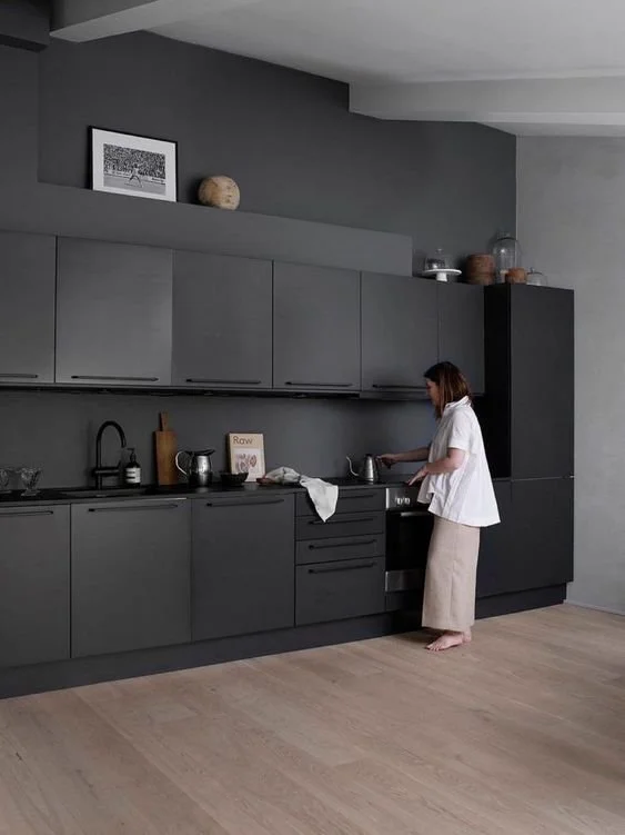
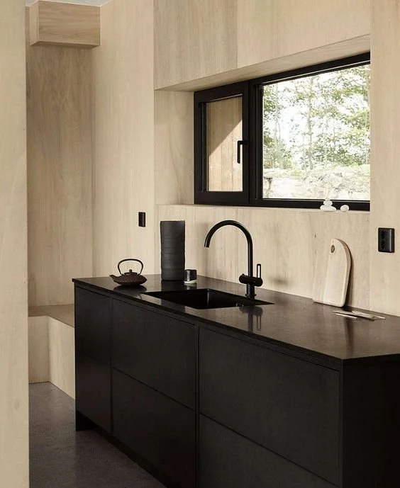
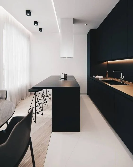
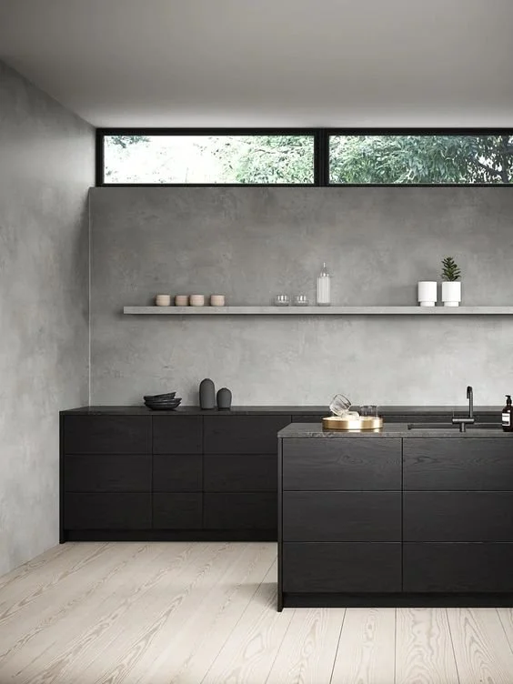
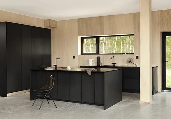
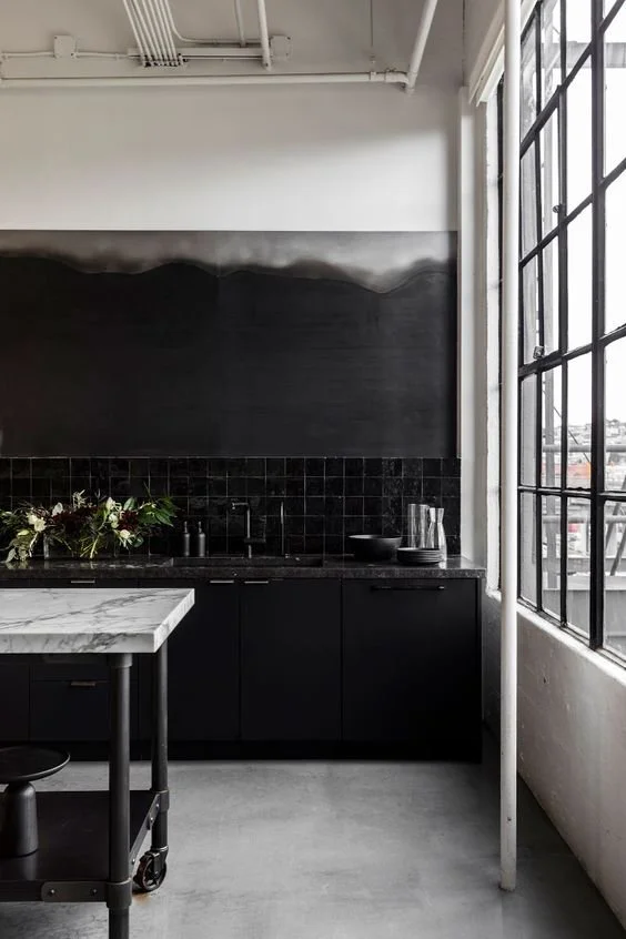
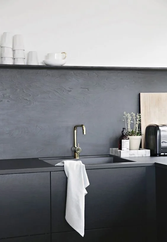
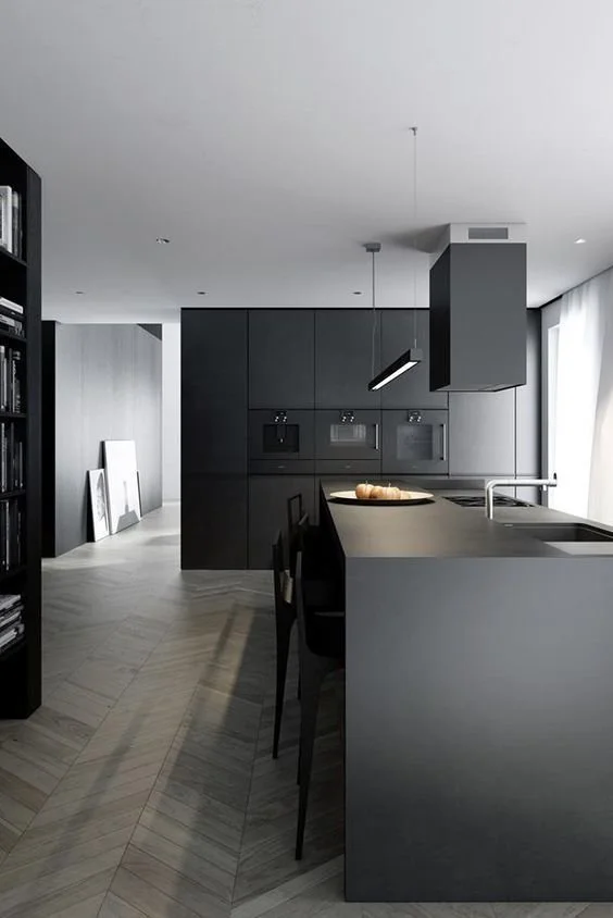
First and foremost, the room will be a common space for employees to use on a daily basis. As such, it needs to be practical, hard-wearing and achieved on a budget. At the same time, it will be client-facing - a space to hold tastings & events, film content and ultimately win over new customers. With this in mind, it also needs to be in line with the brand pillars: most notably being accessible, simple but precise and art-led.
To achieve these aims, I suggested materials that are low cost, industrial and consistent with the rest of the factory, in the core colours above. However, I stressed the importance of clean lines and sleek finishes for an elevated, almost Scandi feel.
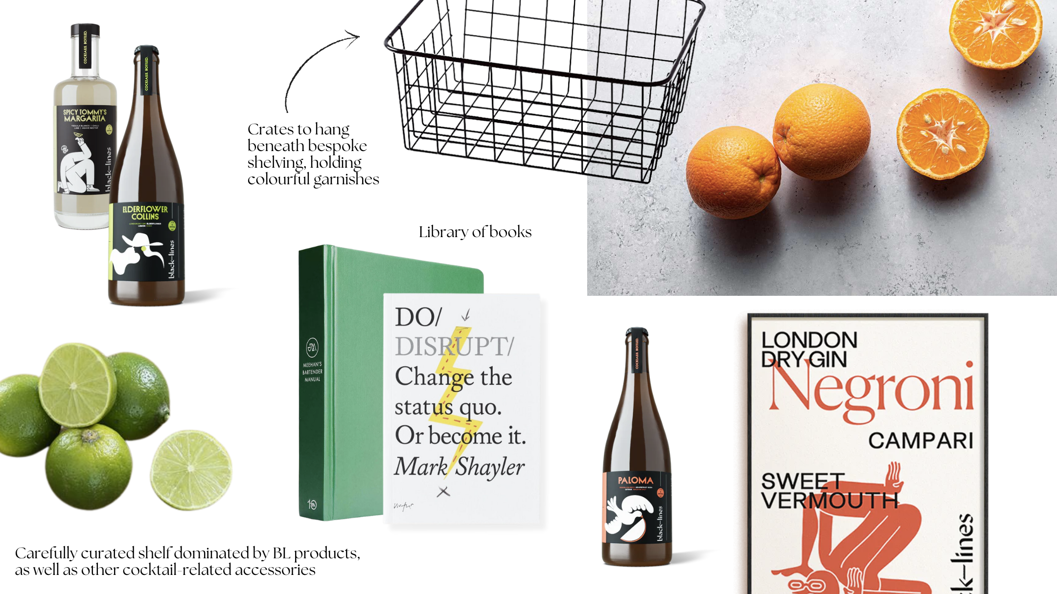
In addition to the core colour palette, I suggested pulling through accent colours from Black Lines’ branding. These are playful, fun and fresh hues that hint at the youthful and frivolous qualities that make the company so unique. They contrast the factory environment and, in doing so, should spark ideas, boost energy and pique interest.
Inspiration
Floor Plan
To get a feel for the space, I also worked up a quick scaled plan. The layout was already decided and the kitchen build in progress, so it wasn’t necessary to test out different layouts here.
Floor
The flooring was a challenging aspect. Whilst the team loved the idea of bare concrete, it just wasn’t possible with the condition of the existing base. To find a cost-effective alternative, reclaimed grey carpet tiles were sourced for the breakout side of the room, whilst a pale grey wood-look laminate was chosen for the kitchen to lighten up the dark, heavy wall of black cabinetry. Here, I suggested the ‘boards’ of the laminate should run perpendicular to the window for a neat join between the two materials. As shown in the floor plan, I also proposed bringing the laminate out just further than the island, to frame the kitchen area. The carpet tiles would then border the table in an even way, creating a sense of order and balance.
Walls
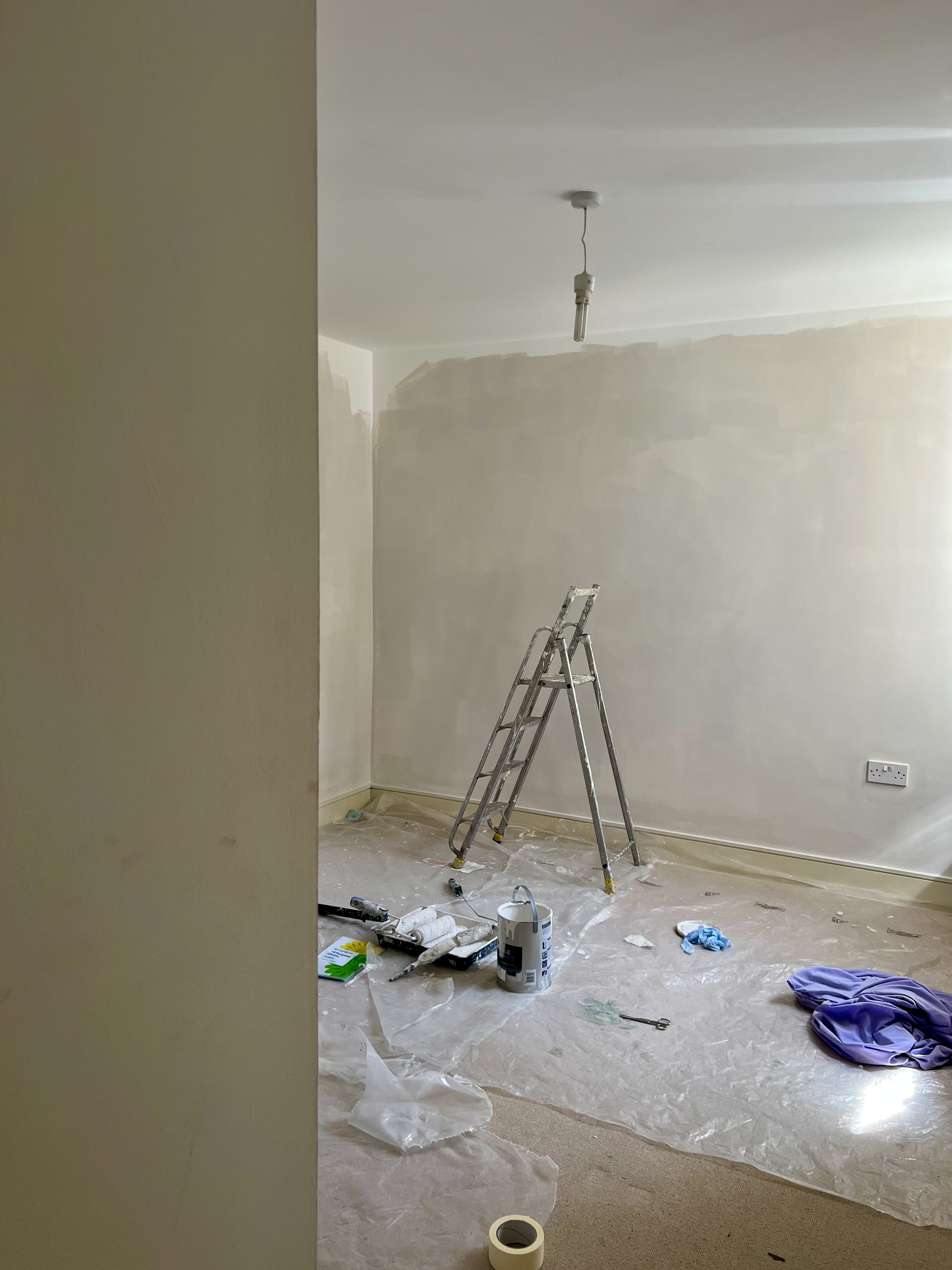
The existing lighting and white walls have a harsh, almost clinical feel that is common in commercial spaces. To soften this, I suggested using a warmer white on the walls - perhaps a paint with yellow undertones. Whilst a Flat Matt finish was specified for its durability and the way in which it hides imperfections, I recommended testing a variety of whites on different walls, to assess which works best under the natural and artificial light across the day. In parallel with this, I suggested adjusting the kelvin of the overhead light.
As a more ‘disruptive’ idea, I proposed painting the wall on the left hand side of the room with a chalkboard paint. As well as balancing the darker right hand side, it would create a unique space for the team to take notes, leave messages, create art and ultimately let ideas flow.
Regardless, the skirting and ceiling should be kept crisp and white for that precise, finished look. A gloss paint is most resistant in a high footfall area.
Moodboards
Sourcing
As always, I provided a sourcing document with links, alternative options and thorough comments about purchasing and installing.
And there you have it! I came to this one at a similar stage to my last post - the team had already got going and made some pretty big design choices. I was simply there to provide some overall direction. Keep your eyes peeled for some progress pics on this one, as it is well underway.


