The Evolution of Style

Okay, one final post on the course before I promise to move on! A few years ago, I wrote about interior design trends throughout the years. From this, I thought I had somewhat of a handle on the changing design tastes across history. Oh, how naive I was…
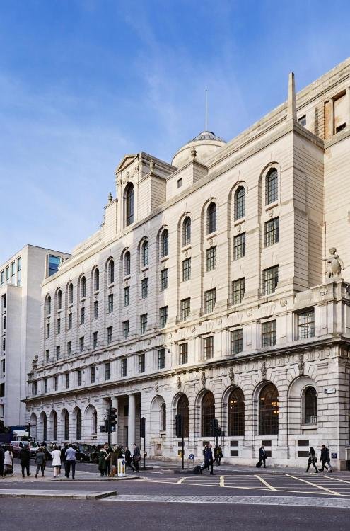
The KLC module on The Evolution of Style was incredibly nuanced - a lesson in both English and French history, with references to monarchs, stately buildings and key architects. It culminated in a project focusing in on one era and a building that required being sensitively reinstated to its former glory, both in its architecture and interior. With a choice of four eras, I decided on the early 20th century and the Fountain House Apartment, constructed in Mayfair between 1935 and 1938.
The Research
To provide some well-needed context, I began by researching key events around the time. Things like The First World War, the discovery of Tutankhamen’s tomb, The Exposition Internationale des Artes Décoratifs et Industriels Modernes (that’s a mouthful) and The Great Depression.
I then set about trying to find a solid definition for this period.
Art Deco is a style of visual arts, architecture and product design that first appeared in France in the 1920s and then spread across the rest of Europe and the US. Shaped by a loosening up of culture, there was an emphasis on fun, expression and excess. Far from the softness and romance that came before, this period used clean lines and simplified forms to represent speed, power and progress. In terms of materials, dark woods such as ebony and walnut were abundant - these were exaggerated by a highly polished finished. In addition, lacquer was used to give a further sense of opulence.
With the birth of Modernism in the latter years of the period, new synthetic materials were introduced and asymmetrical compositions with minimal ornamentation were favoured.
At the same time, there were non-Western, exotic and primitive influences at work, resulting in Egyptian details, the use of animal skins, a prevalence of tribal pieces - items that seem rather at odds to the aforementioned modernist style.
All of the above resulted in an eclectic mix!
So, having somewhat understood the context and the basis of styles, I moved into researching key designers and was immediately drawn to Syrie Maugham’s style. At contrast to the heavy, dark and filled schemes of the past, Maugham focused on space, light and natural tones, resulting in a fresh style. As Joseph Minton stated in 2007, “Syrie offered the fresh new look of the 1930s. Her taste was modern, but not in a severe way. She swept away the cobwebs of the Victorian age”.
Having spent quite a bit of time dissecting Maugham’s schemes, I briefly touched on film sets. The rise of set design, which started in theatres and continued into cinema, bolstered the importance of interior styling. As film was silent and/or in black and white, there was a focus on the image and a sensitivity for textural and tonal contrasts. And Maugham was certainly a part of this - by creating interiors for clients that were both influencing and being influenced by the Hollywood film sets of the time. Such spaces weren’t necessarily designed to be lived in, but rather to give an essence of a particular lifestyle and one’s character.
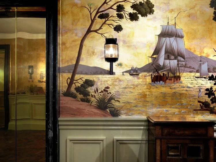
I also looked at key Art Deco hotels within London - The Beaumont, The Savoy and The Ned - the latter of which references the twenties, thirties and forties, with decadence, luxury and opulence at the forefront.
Image source: The Ned Website and Instagram
Finally, I visited The Museum of the Home. I’d wanted to visit since before it (thankfully) rebranded and with time for only a whistle stop tour, I’m definitely keen to visit again to read more on the theoretical approach to the home.
The 1930s/40s room here brought me back to reality and reminded me that whilst there were certainly progressive and forward thinking designers at work in this era, I needed to ensure a realistic balance between the excessively luxurious and the more humble. Taking into consideration the location of the Fountain House apartment and the likely owners (their wealth, status, etc.), the design needed to be sensitive, authentic and most-importantly, liveable in.
The term Art Deco immediately brings to mind images of glamour - bold colour schemes of blacks and golds, luxurious textiles, but this typical living room is almost drab in comparison. Perhaps the sensory overload of previous generations, with patterned wallpapers and bright colours was the reason behind this? Or maybe it's the disparity between high design and the average interior.
The Scheme
Having done quite a bit of research, I tried to put what I had learnt into practise…
I proposed architectural details that were suitable to both the period and the type of property. These included light wood parquet flooring, a simplified version of classic skirting, glass detail in the double doors to enable light to floor the otherwise dark corridor, and a modest stepped ceiling (bearing in mind the relatively low room height). Since it might be difficult to lay underfloor heating without raising the existing concrete floor, I sourced cast iron radiators to place under the windows, where draught often enters.
Given a similar property in the Fountain House building was recently on the market for a cool £3,750,000, I assumed the clients were high end, stylish and urbane, requiring an interior to reflect this. With this in mind, my proposed scheme centred on the work on Syrie Maugham and her ability to create rooms that were an extension of her clients; characters and which oozed a particular lifestyle - one of wealth and sophistication. The room was designed to be a social space for the clients to entertain in, with ample seating in carefully placed zones to encourage conversation.
In terms of colour, The Architectural Review reported that the all-white room had gone out of fashion by 1934 (and the period of construction of Fountain House). Therefore, whilst my scheme leaned on the “all-white” look as a base, I added accents of green. Here, it is worth mentioning that Maugham “used every variation of white - ivory, pearl, oyster, parchment etc. - except the hard and unflattering dead white, or the cream with its associations of suburbia” (Battersby, 1969).
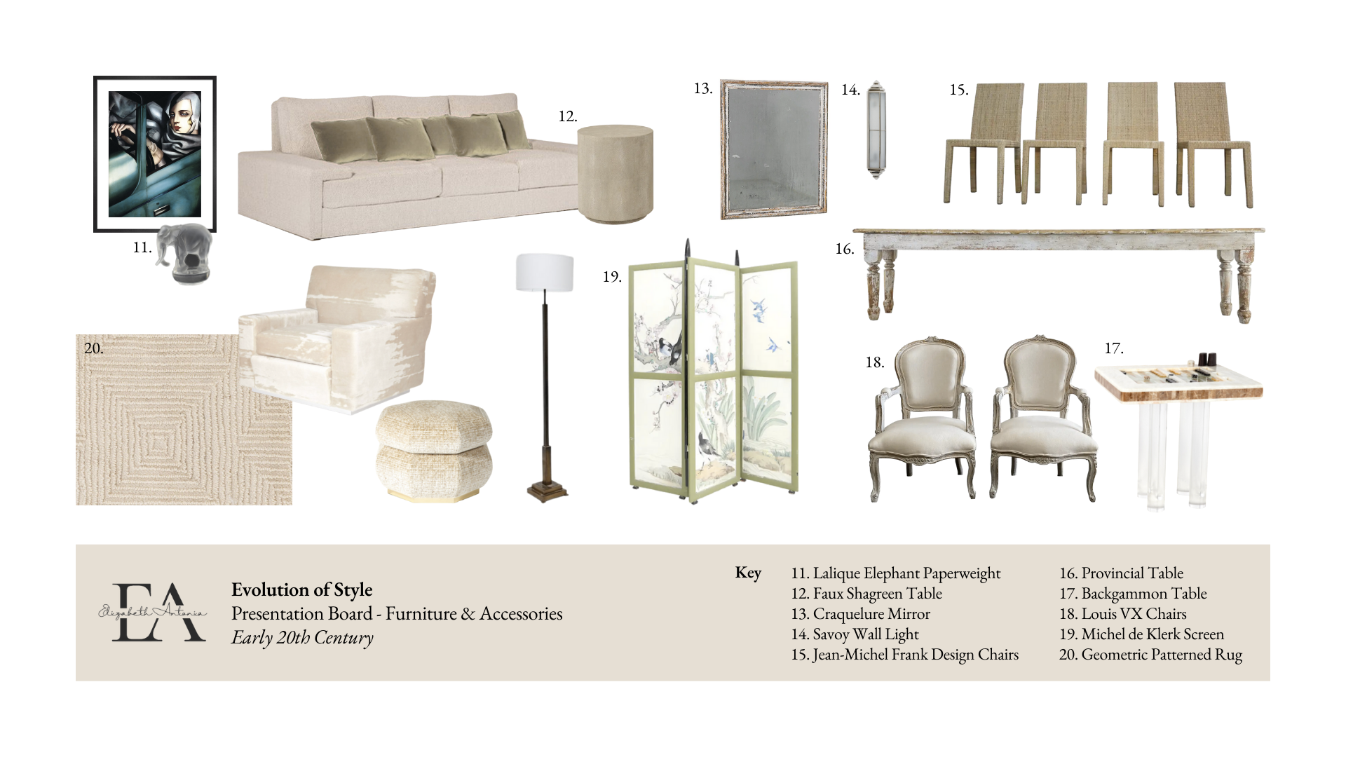
With regards to furniture and accessories, the scheme combined the traditional and contemporary in a typically Maugham way. Baroque firedogs, a craquelure mirror, upholstered Louise XV chairs, a provincial dining table and Jean-Michel Frank style dining chairs were accompanied by a low, boxy sofa by designer Laura Gonzalez and a sustainable faux shagreen table from OKA. Moreover, having discovered that Maugham’s characteristic mirrored screen tended to fall over, a mirror wall covering was sourced that is suitable and safe for present-day use. “As the thirties advanced Mrs Maugham’s interiors tended to become more and more filled with decorative furniture and ornaments which were charming and fantastic but were really superfluous” (Battersby, 1969). It is this superfluous, sense of fullness that was emulated - resulting in a room bursting with interest.
To create a lighting scheme in keeping with the age of the property, yet compatible with modern requirements, localised antique lights (such as a wrought iron central pendant, savoy style wall lights and a modernist floor lamp) were combined with shadow gap ceiling lights, which fill the volume of the room. I proposed the former make use of low wattage bulbs, reminiscent of the initial introduction of electrical lighting, on a separate circuit to achieve different moods. For example, a magical evening scene could be created via the wall sconces bouncing soft, warm light against the mirrored wall - perfect for entertaining special guests.
As a final touch, the artwork of Lempicka was included: the Green Bugatti (1929) embodies art deco ideals of technology and progress with its focus on automobiles and the independence of women. As Tubach (2018) states, “the angular lines on the car, the hard gloss of the metal, and Lempicka’s flying drapery all underscore the image as something new, a creation of the 20th century.”
Focusing in on window treatments, the ‘fussiness’ of the Victorian period gave way to simplicity in the 20th century. In line with this, straight-hung, floor length curtains were sourced to create a slender look. I proposed these sit under a simple box pelmet, just covering the top of the windows and spanning the length of the room - made bespoke and painted in James White Estate Eggshell by Farrow & Ball. Whilst Syrie Maugham and similar designers used plain face fabrics, a gentle geometric pattern in a muted colour adds a touch of interest and nods to the popular motifs of the era. Lining was also specified to create structure. When stacked back, the form would mimic the columns seen repeatedly across the research.
Beneath these, sheer drapes soften the area, diffuse light and conceal the awkward space between the floor length curtains and the half length windows. Whilst the particular fabric sourced was made of polyester - which didn’t reach the market until the 1950s - it nods to the introduction of synthetic materials in window treatments in the era.
The overall result is fresh, light and full - a space to talk within and about.
CAD drawings
Once I’d space planned, I finished off with CAD drawings.
The double doors opened onto the first seating area: made up of a low, boxy mohair velvet sofa and armchairs that mimic Paul Frankl’s Speed Chair in form, all delineated by a geometric patterned rug. Though small, the focal point was undoubtedly the polished steel fireplace, reminiscent of Syrie Maugham’s designs. This was flanked by two bespoke bookshelves, housing various treasures.
Behind this was the second seating area: a provincial dining table with Jean-Michel Frank style rattan dining chairs. An antique screen can be moved around the room, to provide privacy as required.
The final seating area was intimate and tucked away against the wall: a space for a game of backgammon or for the spilling of secrets, all from the luxury of upholstered Louis XV style chairs.
Evolution of style was a module that was certainly overwhelming at first (this feeling of overwhelm probably continued up until my hand in to be honest) but it made me realise that my initial understanding of art deco - shiny, lacquered, garish - was wrong. It is far more than this slightly cartoonish, hyperbolic idea I had. And so much more tasteful!


